Component Guide
Basic Elements
Heading
This is a dummy heading for IHNA.
Props
heading
This takes in the heading for the title.
white
This will help reverse the color
eg:
Additional Info
- If you spot any edge cases regarding the Heading, let me know.
Simple Image
Props
imageURL
This takes in the relative URL of the image.
alt
The alt description goes here.
customClass
This takes in class that you would want to add to svg.
eg:
Additional Info
- Its best to add it inside a flex child.
- Should not be used in SSR Pages
Circle Image
Props
imageURL
This takes in the relative URL of the image.
alt
The alt description goes here.
customClass
This takes in class that you would want to add to svg.
tangerine
This updates the color of the background element. By default its green.
eg:
Additional Info
- Its best to add it inside a flex child.
- Should not be used in SSR Pages
Simple Image Animated
Props
imageURL
This takes in the relative URL of the image.
alt
The alt description goes here.
customClass
This takes in class that you would want to add to svg.
primary || secondary
This two different styles of background animation.
reverse
This reverses the direction of the background elements.
eg:
Additional Info
- Its best to add it inside a flex child.
- Should not be used in SSR Pages
Double Image Verification
Props
firstImage
This takes in an object of src & alt. eg: {src:'location of the image', alt:'alt description of the image'}
secondImage
This takes in an object of src & alt. eg: {src:'location of the image', alt:'alt description of the image'}
reverse
This will reverse the order of the html element
top
This will change the vertical alignment of the component
eg:
Additional Info
- Its best to add it inside a flex child.
- Should not be used in SSR Pages
Double Image Star
Props
firstImage
This takes in an object of src & alt. eg: {src:'location of the image', alt:'alt description of the image'}
secondImage
This takes in an object of src & alt. eg: {src:'location of the image', alt:'alt description of the image'}
reverse
This will reverse the order of the html element
top
This will change the vertical alignment of the component
eg:
Additional Info
- Its best to add it inside a flex child.
- Should not be used in SSR Pages
Triple Image Circle
Props
firstImage
This takes in an object of src & alt. eg: {src:'location of the image', alt:'alt description of the image'}
secondImage
This takes in an object of src & alt. eg: {src:'location of the image', alt:'alt description of the image'}
thirdImage
This takes in an object of src & alt. eg: {src:'location of the image', alt:'alt description of the image'}
eg:
Additional Info
- Its best to add it inside a flex child.
- Should not be used in SSR Pages
Verification Animation
Props
green
This make the bakes green themed. By default its white.
eg:
Additional Info
- The width needs to adjusted through parent, as it is full width.
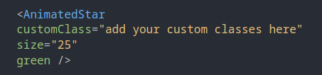
Animated Star
Props
customClass
This takes in class that you would want to add to svg.
size
This prop is set the height of the size of the element
white, tangerine, green
This is to set the color of the element
eg:
Additional Info
- Normal 'class' wont work
- Do not add color prop if you want transparent element
UI Elements
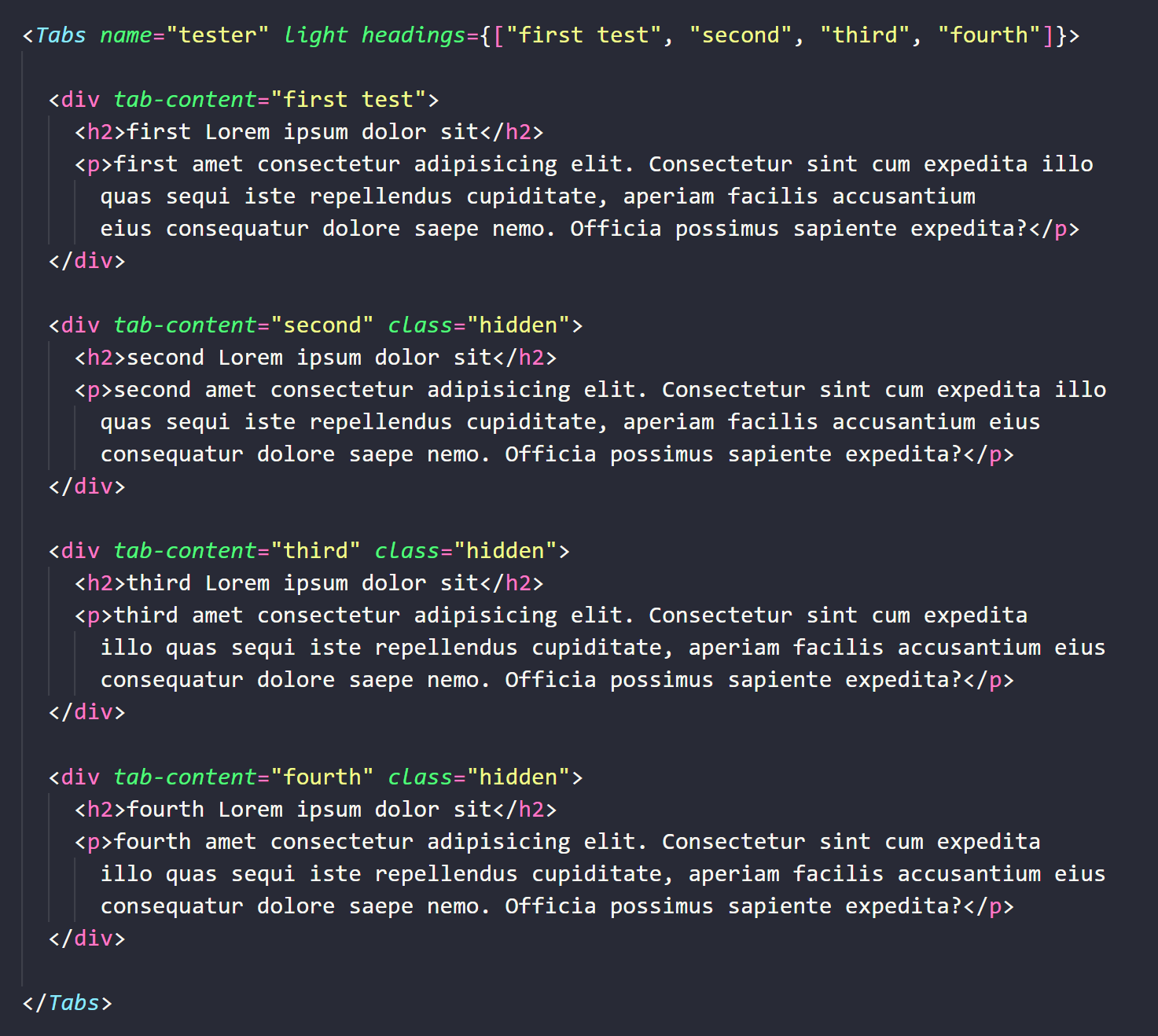
Tab Component
first Lorem ipsum dolor sit
first amet consectetur adipisicing elit. Consectetur sint cum expedita illo quas sequi iste repellendus cupiditate, aperiam facilis accusantium eius consequatur dolore saepe nemo. Officia possimus sapiente expedita?
second Lorem ipsum dolor sit
second amet consectetur adipisicing elit. Consectetur sint cum expedita illo quas sequi iste repellendus cupiditate, aperiam facilis accusantium eius consequatur dolore saepe nemo. Officia possimus sapiente expedita?
third Lorem ipsum dolor sit
third amet consectetur adipisicing elit. Consectetur sint cum expedita illo quas sequi iste repellendus cupiditate, aperiam facilis accusantium eius consequatur dolore saepe nemo. Officia possimus sapiente expedita?
fourth Lorem ipsum dolor sit
fourth amet consectetur adipisicing elit. Consectetur sint cum expedita illo quas sequi iste repellendus cupiditate, aperiam facilis accusantium eius consequatur dolore saepe nemo. Officia possimus sapiente expedita?
Props
name
This takes in the name of the tab. If there are multiple abs in a page, make sure this is unique.
headings
This takes in an array of headings. The content inside the component should have "tab-content" with the corresponding heading.
horizontal
This will make the tabs horizontal, only works on desktop
light || dark
This will set the tabs color palette to light || dark.
customClass
This takes in any custom classes, you want to add to the button or a tag.
eg:
Additional Info
- The "tab-content" is a must
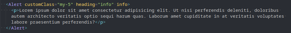
Alert
basic
Lorem ipsum dolor sit amet consectetur adipisicing elit. Ut nisi perferendis deleniti, doloribus autem architecto veritatis optio sequi harum quas. Laborum amet cupiditate in at veritatis voluptates labore praesentium perferendis?
info
Lorem ipsum dolor sit amet consectetur adipisicing elit. Ut nisi perferendis deleniti, doloribus autem architecto veritatis optio sequi harum quas. Laborum amet cupiditate in at veritatis voluptates labore praesentium perferendis?
alert
Lorem ipsum dolor sit amet consectetur adipisicing elit. Ut nisi perferendis deleniti, doloribus autem architecto veritatis optio sequi harum quas. Laborum amet cupiditate in at veritatis voluptates labore praesentium perferendis?
danger
Lorem ipsum dolor sit amet consectetur adipisicing elit. Ut nisi perferendis deleniti, doloribus autem architecto veritatis optio sequi harum quas. Laborum amet cupiditate in at veritatis voluptates labore praesentium perferendis?
Props
heading
This is the heading of the alert component.
info
This is for the green color palette indicating non-threatening content.
alert
This is for the yellow color palette indicating threatening content.
danger
This is for the red color palette indicating dangerous content
customClass
This takes in any custom classes, you want to add to the button or a tag.
eg:
Additional Info
- If none of info || alert || danger is passed through it would create the white color version.
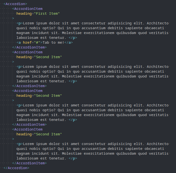
Accordion
-
Lorem ipsum dolor sit amet consectetur adipisicing elit. Architecto quasi nobis optio? Qui in quo accusantium debitis sapiente obcaecati magnam incidunt sit. Molestiae exercitationem quibusdam quod veritatis laboriosam est tenetur.
Tab to me! -
Lorem ipsum dolor sit amet consectetur adipisicing elit. Architecto quasi nobis optio? Qui in quo accusantium debitis sapiente obcaecati magnam incidunt sit. Molestiae exercitationem quibusdam quod veritatis laboriosam est tenetur.
-
Lorem ipsum dolor sit amet consectetur adipisicing elit. Architecto quasi nobis optio? Qui in quo accusantium debitis sapiente obcaecati magnam incidunt sit. Molestiae exercitationem quibusdam quod veritatis laboriosam est tenetur.
-
Lorem ipsum dolor sit amet consectetur adipisicing elit. Architecto quasi nobis optio? Qui in quo accusantium debitis sapiente obcaecati magnam incidunt sit. Molestiae exercitationem quibusdam quod veritatis laboriosam est tenetur.
-
Lorem ipsum dolor sit amet consectetur adipisicing elit. Architecto quasi nobis optio? Qui in quo accusantium debitis sapiente obcaecati magnam incidunt sit. Molestiae exercitationem quibusdam quod veritatis laboriosam est tenetur.
Tab to me! -
Lorem ipsum dolor sit amet consectetur adipisicing elit. Architecto quasi nobis optio? Qui in quo accusantium debitis sapiente obcaecati magnam incidunt sit. Molestiae exercitationem quibusdam quod veritatis laboriosam est tenetur.
-
Lorem ipsum dolor sit amet consectetur adipisicing elit. Architecto quasi nobis optio? Qui in quo accusantium debitis sapiente obcaecati magnam incidunt sit. Molestiae exercitationem quibusdam quod veritatis laboriosam est tenetur.
-
Lorem ipsum dolor sit amet consectetur adipisicing elit. Architecto quasi nobis optio? Qui in quo accusantium debitis sapiente obcaecati magnam incidunt sit. Molestiae exercitationem quibusdam quod veritatis laboriosam est tenetur.
Props
heading
This is the heading of the each accordion item component. Each accordion item must have heading
eg:
Additional Info
- The colors of the contents need to be managed separately.
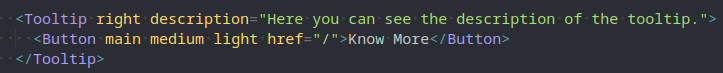
Tooltip
Props
top || right || left || bottom
This specifies the direction of the tooltip information. Each tooltip item must have a direction
description
This specifies the information of the tooltip. Each tooltip item must have a description
eg:
Additional Info
- Best suited for small elements
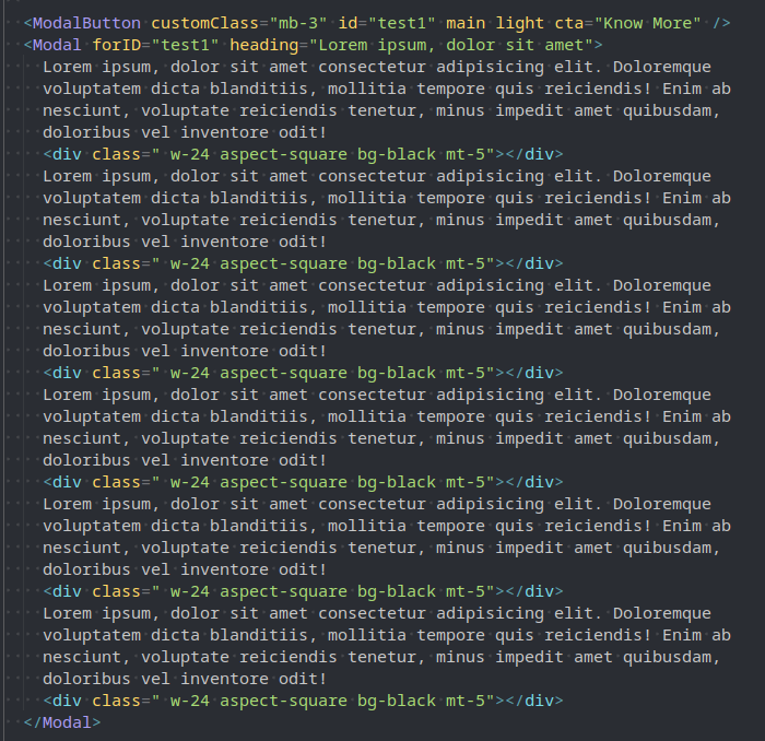
Modal
Props
main || soft || outline || textonly
One of these will help you define the style of the Modal Button.
id
Modal Button should have 'id' this will help map the modal to the modal button.
light || dark
The sets the color mode of the Modal Button
cta
This helps set the CTA of the modal button.
customClass
This helps add custom class to the modal button
forID
This helps connect the modal button to the modal component.
heading
Heading is required to add a header to the modal component.
eg:
Additional Info
- Anything can be added as children in the modal including forms.
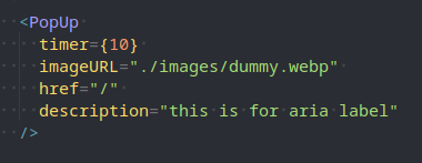
Image PopUp
Props
timer
This takes in a number that can be used to set the countdown for the PopUp.
imageURL
this takes in the URL for image.
href
This the click through link for the PopUp.
description
This takes in the description for the aria-label.
eg:
Additional Info
- This component can support multiple popups in a page without conflict.
- Just make sure the timer is different.
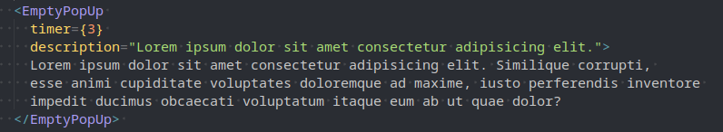
Empty PopUp
Props
timer
This takes in a number that can be used to set the countdown for the PopUp.
description
This takes in the description for the aria-label.
eg:
Additional Info
- This component can support multiple popups in a page without conflict.
- Just make sure the timer is different.
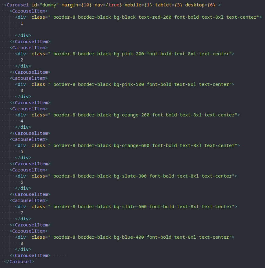
Carousel Component
Props
id
Carousel component requires an unique id.
nav
'nav' is boolean value that can turn on / off the navigation coomponent of the carousel.
animation
'animation' is a boolean value can turn on / off the automated animation feature.
animationDelay
This takes in the animation delay in seconds.
mobile
Specifies the number of items to be displayed in 'mobile' device.
tablet
Specifies the number of items to be displayed in 'tablet' device.
desktop
Specifies the number of items to be displayed in 'desktop' device.
eg:
Additional Info
- Seems to be a bit buggy right now. Use carefully.
Cards
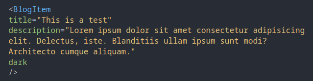
Blog Home Card
Props
imageURL
This is for passing in the unique images
title
This is for passing in the Title of the card
description
This is for passing in the description of the card
dark
This is for enabling dark mode. To enable be used for dark backgrounds.
eg:
Additional Info
- ormal 'class' wont work
- Should be wrapped in a grid
Inputs
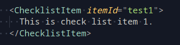
Checklist
Props
itemId
This takes in an unique ID, to create the strikethrough on the text when checked.
eg:
Additional Info
- if you want to recreate the checkbox use these classes: block m-1 w-6 h-6 focus:ring-PineGreen-900 text-AtomicTangerine-900 rounded-full peer
Props
main || soft || outline || textonly
Has to speciy any one of these styles.
light || dark
Has to speciy any one of these color mode.
customClass
This takes in any custom classes, you want to add to the button or a tag.
button
This toggles the button tag. By default it is a tag
rounded
This toggles the rounded-full class when enabled.
large || medium || small
Has to specify any one of these three sizes.
eg:
Additional Info
- Additional properties like onClick and href can be passed through normally.
Award Carousel
Awards Received by IHNA
Celebrating Accomplishments and Achievements.
Props
xxxx
xxxx
eg:
Additional Info
- xxxx
Badge
heading
Props
badgeTitle
This will be the text inside the badge.
white
This will makes the border and text color of the badge to white
customClass
This takes in any custom classes.
eg:
Additional Info
- xxxx
Border strip
Props
white
This will makes the color combination of the strip green and white
eg:
Additional Info
- xxxx
List
-
lorem ipsum one
-
lorem ipsum two
Props
bullets
This will be list content.
customClass
This takes in any custom classes.
eg:
Additional Info
- xxxx
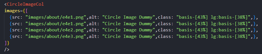
Circle Image Col


Props
images
This shows all the images, we will pass the images as objects with src, alt and class if required
eg:
Additional Info
- xxxx
GradientBorderLine
Props
white
This will change the color to white
reverse
This will reverse the line
customClass
This takes in any custom classes.
eg:
Additional Info
- xxxx
Know more link
Props
dark
This will change the colors for the dark background.
cta
This will be the cta.
link
This will be the link
eg:
Additional Info
- xxxx
Virtual Tour animation
Props
xxx
xxx
eg:
Additional Info
- xxxx

Props
details
xxx
dark
xxx
eg:
Additional Info
- xxxx
Event Card
event name
event location
event date
event time
event description
Read MoreProps
name
xxx
location
xxx
time
xxx
date
xxx
link
xxx
description
xxx
eg:
Additional Info
- xxxx
Gallery Item
Props
imageURL
xxx
alt
xxx
title
xxx
link
xxx
eg:
Additional Info
- xxxx
Icon And Content With Border
Heading
Description
Sub heading
Sub description
Props
heading
xxx
description
xxx
subHeading
xxx
subDescription
xxx
eg:
Additional Info
- xxxx
Latest News Card
news Title
Change the way you think about your capabilities in business and management and upskill or take .
Props
latestNewsCards
xxx
eg:
Additional Info
- xxxx
Group of links
Props
list
xxx
eg:
Additional Info
- xxxx
Group of links section
Stay Ahead with In-Demand Skills.
Lorem Ipsum is simply dummy text of the printing and typesetting industry
Props
heading
xxx
description
xxx
list
xxx
eg:
Additional Info
- xxxx
News Box
Props
newsBoxes
xxxx
eg:
Additional Info
- xxxx
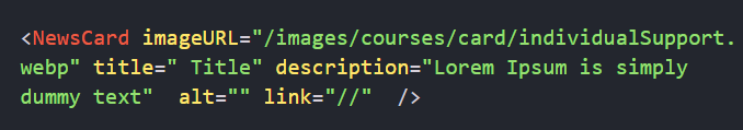
News card
Props
imageURL
xxxx
title
xxxx
description
xxxx
alt
xxxx
link
xxxx
eg:
Additional Info
- xxxx
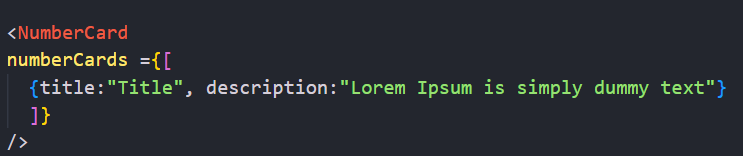
Number card
\ 01
Title
Lorem Ipsum is simply dummy text
Props
numberCards
xxxx
eg:
Additional Info
- xxxx
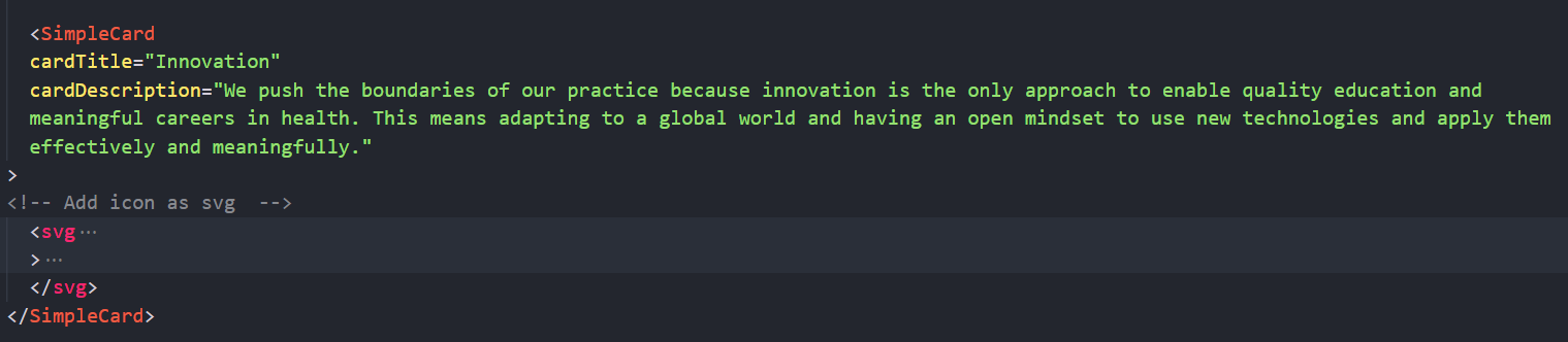
Simple card
Innovation
We push the boundaries of our practice because innovation is the only approach to enable quality education and meaningful careers in health. This means adapting to a global world and having an open mindset to use new technologies and apply them effectively and meaningfully.
Props
cardTitle
xxxx
cardDescription
xxxx
eg:
Additional Info
- xxxx
Simple square image
Props
imageURL
xxxx
reverse
xxxx
alt
xxxx
secondary
xxxx
primary
xxxx
customClass
xxxx
eg:
Additional Info
- xxxx
Single Description Section
Lorem ipsum dolor sit amet consectetur adipisicing elit. Id, vel illum. Velit earum laborum possimus et necessitatibus aspernatur enim nisi incidunt dicta nemo excepturi, doloribus dolorem placeat suscipit, error minima.
Props
lightTangerine
xxxx
eg:
Additional Info
- xxxx
Stats
Lorem ipsum dolor sit amet consectetur
Props
prefix
xxxx
number
xxxx
description
xxxx
eg:
Additional Info
- xxxx
Trending Card
h1234
first aid
Amount of training:
Props
code
xxxx
course
xxxx
tagline
xxxx
training
xxxx
link
xxxx
eg:
Additional Info
- xxxx
Aboriginal band

Props
xxxxx
xxxx
eg:
Additional Info
- xxxx
Close Button
Props
id
xxxx
customClass
xxxx
onclick
xxxx
eg:
Additional Info
- xxxx
IHNALogo

Props
link
xxxx
customClass
xxxx
white
xxxx
id
xxxx
eg:
Additional Info
- xxxx
Details Link
Props
link
xxxx
cta
xxxx
heading
xxxx
description
xxxx
eg:
Additional Info
- xxxx
Dropdown Tab
first Lorem ipsum dolor sit
first amet consectetur adipisicing elit. Consectetur sint cum expedita illo quas sequi iste repellendus cupiditate, aperiam facilis accusantium eius consequatur dolore saepe nemo. Officia possimus sapiente expedita?
second Lorem ipsum dolor sit
first amet consectetur adipisicing elit. Consectetur sint cum expedita illo quas sequi iste repellendus cupiditate, aperiam facilis accusantium eius consequatur dolore saepe nemo. Officia possimus sapiente expedita?
third Lorem ipsum dolor sit
first amet consectetur adipisicing elit. Consectetur sint cum expedita illo quas sequi iste repellendus cupiditate, aperiam facilis accusantium eius consequatur dolore saepe nemo. Officia possimus sapiente expedita?
Props
name
xxxx
headings
xxxx
horizontal
xxxx
dark
xxxx
customClass
xxxx
eg:
Additional Info
- xxxx
Blog Author Strip
Props
imageURL
xxxx
name
xxxx
description
xxxx
link
xxxx
eg:
Additional Info
- xxxx
Blog Details Banner

Australia welcomes international students.
Change the way you think about your capabilities in business and management and upskill or take a new direction to your career confidently.
Props
heading
xxxx
subtitle
xxxx
eg:
Additional Info
- xxxx
Campus Banner
Brisbane offers world-class education to international students. The city’s universities, apprenticeship colleges, and English-language learning centres welcome above 40,000 foreign students each year from a myriad of cultures and continents.
Props
heading
xxxx
subtitle
xxxx
arrowLink
xxxx
description
xxxx
eg:
Additional Info
- xxxx
Team Box

Props
name
xxxx
designation
xxxx
imageURL
xxxx
DisableImage
xxxx
xxxx
customClass
xxxx
eg:
Additional Info
- xxxx
Bottom Large image banner
Contact us
Get an answer on courses, costs, careers as well as facilities, entry requirements or just about anything.
Get an answer on courses, costs, careers as well as facilities, entry requirements or just about anything else relating to studying at IHNA. We are here to help you!
Props
heading
xxxx
buttonName
xxxx
description
xxxx
imgUrl
xxxx
alt
xxxx
link
xxxx
eg:
Additional Info
- xxxx
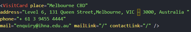
Visit Card
Melbourne CBD
Level 6, 131 Queen Street,Melbourne, VIC – 3000, Australia
Props
place
xxxx
address
xxxx
phone
xxxx
xxxx
contactLink
xxxx
mailLink
xxxx
eg:
Additional Info
- xxxx
side image section
Explore Transnational Education Partnership Opportunities with Us!
Through international campuses and international partnerships, we hope to expand our physical and virtual presence. To do so, we're looking for high-quality partners that share IHNA's passion to providing a good student experience.
Please contact IHNA to learn more about being a transnational education partner with IHNA.

Props
imageURL
xxxx
alt
xxxx
heading
xxxx
cta
xxxx
link
xxxx
reverse
xxxx
eg:
Additional Info
- xxxx
Pathway Image Group


Props
firstImage
xxxx
secondImage
xxxx
eg:
Additional Info
- xxxx
Horizontal tab with in a box
Additional Details
first Lorem ipsum
second Lorem ipsum
third Lorem ipsum
fourth Lorem ipsum
fifth Lorem ipsum
Props
heading
xxxx
content
xxxx
eg:
Additional Info
- xxxx
Pathways
Pathways
Relevant Courses for Comprehensive Learning.
- Associate Diploma in Early Childhood Education and Care
Props
pathways
xxxx
eg:
Additional Info
- xxxx